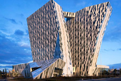
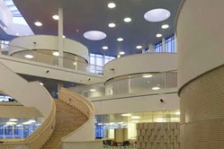
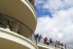
"3XN Choreographs Steps in the Sky - Bella Sky Hotel", Mark, October/November 2011
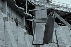
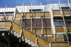
"Cut, Crop, Erase, Fill - Stefan Forster Chops Off Entire Floors of Social Housing Blocks in Need of Renovation" Mark, April/May 2011
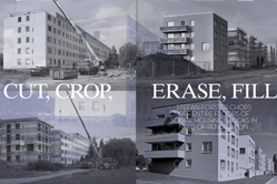
| stefan forster_mark.pdf |
Office Transformation in London: 10 Hills Place by Amanda Levete Architects, ArchitectureWeek, September 2010
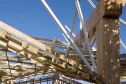
Radical housing renovation in London by Make, ArchitectureWeek, 7 July 2010
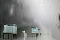
R&Sie´s Parisian courtyard renovation is both a family home and "hydroponic green cloak", Mark, March 2010
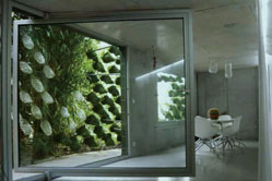
| rsie_mark_magazine.pdf |
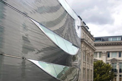
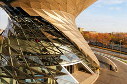
Horten Office´s innovative facade by Danish architects 3XN with GXN, Mark, March 2010
| 3xn_mark_magazine.pdf |
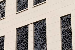
Eden Bio in Paris, ArchitectureWeek, March 2010
Trust in Design, Mark Magazine, October 2009
| trust_in_design.pdf |
'Phillip Beesley Envisions an Architecture that Breathes and Grows' Mark magazine, September 2009

| philip_beesley_mark_magazine.pdf |
Ørestad School, Copenhagen, 3XN, ArchitectureWeek, October 2009
'Philippe Rahm's Digestible Gulfstream', On Site Review, Issue 21 'Architecture and Weather'
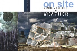
| philippe_rahm.pdf |
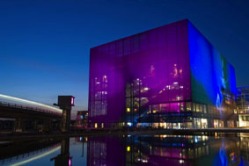
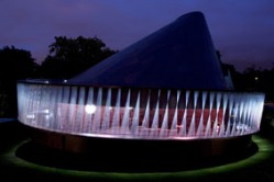
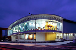
'Magic Blue Box' Jean Nouvel's Copenhagen Concert Hall, ArchitectureWeek, 22 July 2009
DesigntoProduction, Mark Magazine, April/May 2009
DesigntoProduction take complexity from design to realization....Zurich-Stuttgart designers Designtoproduction are the people to turn to when you need to design and fabricate 18 km of unique, doubly curved, timber roof beams, accurately, on time and on budget (Shigeru Ban, Centre Pompidou, Metz). Or when you have an idea for a building with a doubly-curved timber and glass dome façade, and when you find out you need 6500 glass panels, you decide you’d like them to be flat panels for budget reasons – but somehow you’d still like it to be shaped like an egg (Renzo Piano, Peek and Cloppenburg, Cologne). Basically, if the design has the phrase ‘doubly curved’ as a descriptor, the average CAD technician isn’t going to be able to figure out how to draw it, and the contractor won’t have a clue how to price it. That’s when you call up Designtoproduction. 'Lots of different problems come up when people try to build complex forms,' Scheurer explains. 'It’s not like a lot of structural engineers, architects, or fabricators are any good at Euclidian geometry.' He laughs modestly (somehow he is both a people person and a computer programmer): 'Maybe half the problems would be fixed if people would just read more geometry books.'... Read more in Mark Magazine April/May 2009.
'Clouds' installation by Tokujin Yoshioka, Mark Magazine, April/May 2009
Ephemeral hand-made environment with a high-tech digital aesthetic...Entering ‘Clouds’, the visitor’s first impression is one of a surprise and disorientation—rarely is art experienced in a gallery by looking up. As the light reflects on the sea of thousands of dangling transparent fibers hung from the ceiling, the effect of the gently moving strands is pleasantly disorienting, magical and atmospheric. The edges of the gallery space seem blurred, and it’s less defined where the ceiling begins or ends. If it weren’t for the other visitors in the all white environment, it would be hard to know up from down…The varying lengths and spacing of the fibers look like they were digitally designed or computed somehow, like the result of some complicated genetic algorithm or abstraction of a natural pattern (like a cloud). Surely there must be some connection to between this PVC landscape and his of-the-moment, emergent crystal research? But here Yoshioka’s concern was the visitor’s experience of the space, not highlighting a natural process or showing off a digital tool or programming code. Although during the design process, Yoshioka turned to the computer first to produce soft renderings of the space, rather than sketching or drawing by hand, he used the computer more as a way of sketching, than as a production tool. Under his supervision, about a hundred architecture students worked for a month to hand-fix the 360,000 plastic strands, individually strung on wire mesh panels…Read more in Mark Magazine April/May 2009.
"Copenhagen Elephant House", Copenhagen by Foster + Partners Architects, ArchitectureWeek, April 2009
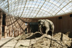
The Copenhagen Zoo's new Elephant House by Foster + Partners emerges gently from the surrounding park grounds, its two leaf-patterned glass domes topping walls of pink-hued concrete. At once playful and serious, transparent and solid, this modern menagerie provides both high-quality living conditions for the animals inside and an exciting and interactive visitor experience. Two oval-shaped domes cover the main herd "stables," or indoor living areas, with lightweight, low-e double glazing. The overlapping leaf pattern etched into the glass panels was designed using computer code to rotate and shift the abstracted leaf shapes. The result is a decorative shading device that provides some variation in lighting level for the elephants below. Pop-out ventilation panels in the domes open automatically when the environment gets too stuffy, such as when the room is being cleaned and water creates a steamy environment. The ventilation system can also be manually operated by staff when required. Rainwater is collected from the roof and used for washing the elephants. The geometry of the domes was digitally rationalized into planar quadrilateral surfaces (flat sheets of four-sided glass); no triangulated or curved glass was necessary. This allowed for the construction of a complex, doubly curved surface in a relatively inexpensive way. Read more here.
Tokyo Swatch building, Shigeru Ban Architects, March 2009, Architectureweek.com
The new Swatch flagship store in Tokyo's Ginza district immediately stands out from the surrounding high-end fashion boutiques on this densely packed street. There is no doorway, no visible sign, and no glass storefront. Instead, a towering four-story void in the streetscape seems to signify a civic-scale entry. The building's enormous retractable glass "shutters" create this dramatic effect when open. Then when the shutters are down — on rainy days and when the shop is closed — the building is disguised as a normal, curtain-wall office building. This unusual store, named the Nicolas G. Hayek Center, is the work of U.S.-trained Japanese architect Shigeru Ban. Even at first glance, the building reveals itself as more than just a fancy facade: it is real architecture, a project about volume, spatial complexity, and experimentation. As visitors step off the busy sidewalk into the lobby of the 14-story Swatch building, no merchandise presents, and no salespeople patrol the door. A subtle change in floor material marks the low-key threshold between the sidewalk and the interior showroom. The massive lobby is dotted with glazed hydraulic elevators, planted trees, and a 13-story-tall hanging garden wall. "As we have no space for the garden on the ground floor, we are just suspending it instead," he adds. Read more here.
"Snøhetta Hits A High Note" Oslo Opera House, Norway, Snøhetta Architects, Azure Magazine, 2008
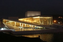
Equal part public plaza and state-of-the-art home of the Norwegian Opera & Ballet, Snohetta's bold architectural statement instantly sheds opera’s snooty, high-art image. The Opera House has welcomed thousands since it opened in April, encouraging passersby to peer through its glazed auditoriums and lobbies. Despite the building’s complicated nature, the competition-winning concepts are evident throughout: an interior oak wave wall dividing inside from outside, and water from land; a metal-clad “factory” housing production spaces; and the white stone “carpet” of the wrap-around plaza. All of these erect the monument along horizontal rather than vertical lines. Read more here.
"Coop Himmelb(l)au´s BMW World", ArchitectureWeek, April 16, 2008.
"Young Vic Theatre", ArchitectureWeek, August 2008
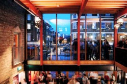
The redesigned Young Vic Theatre by London architects Haworth Tompkins is more than just the extension and renovation of a local theater in Lambeth, South London. It is a radical, minimally designed new facility that celebrates the history of the place and highlights the ambitions of the local arts community. Shortlisted for the prestigious RIBA Stirling Prize in 2007, the £12.5 million rebuild and expansion keeps much of the rough, industrial aesthetic so loved in the original building, but enhances and enlarges the theater, blurring the lines between front and back of house, and maintaining the informal relationships between performer and audience. The concept is a collage of old and new, with flexible, multiuse designs for workshops, theaters, studios, offices, and public spaces, carefully arranged on this tight, unapologetically urban site. Located on The Cut — the same street as its more formal and grown-up counterpart, the Old Vic — the Young Vic was conceived of as an experimental venue. Now independent, it was founded as an offshoot of the Royal National Theatre in 1970 to give younger actors and directors the opportunity to develop and perform in up-and-coming productions, often aimed at younger audiences. Read more here.
'Movin' On Up', House in Shoreditch, London, Tonkin Lui Architects with Richard Rogers, Azure Magazine, 2008
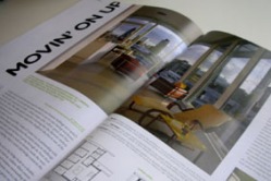
At night, the Roof Garden Apartment competes with the most dramatic buildings on London's Shoreditch skyline: a two-storey glowing lantern perched on top of a once boring warehouse. From the street, vertical bands of color - vibrant orange, pink, yellow, green and blue - emanate from within. What might surprise a passerby is knowing that this skyward rainbow that is lit up by neon comes from the bedroom walls of four daughters who live in one of the city's most unusual family homes. Designed by local architects Anna Liu and Mike Tonkin of Tonkin Liu, in partnership with celebrated architect Lord Richard Rogers, everything about this project seems to challenge expectations. For instance, the family doesn't enter the home by going through the front door and up the stairs. Spatial constraints made it impossible to build an elevator inside the warehouse. Instead, access is via a neighboring building, where a mesh-clad bridge connects the two rooftops. Entering the house through a bright red door at the end of the bridge leads to a double-
height foyer, and to the children’s rooms, arranged around a built-in, cushion-filled conversation pit. Upstairs, the space is an open concept with triple-glazed windows surrounding the kitchen and living room. Tucked behind the kitchen and sky-lit bathroom core is a sleeping area for the parents. From this level, a mesh-clad spiral staircase leads to a green roof terrace that houses solar panels, a garden and space for play and admiring the view. Read more here.
| azure_shoreditch_house.pdf |
Heathrow Terminal 5, Rogers, Stirk, Harbour + Partners, ArchitectureWeek, August 2008
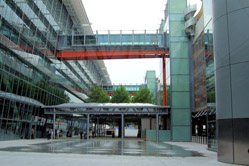
The saga of building the ambitious new terminal began in 1989, when Rogers won the design competition with engineer Peter Rice and Arup structural engineers. Their scheme called for a sprawling single-level concourse covered by an undulating roof. Following the competition win, the design changed dramatically during the planning process and four-year public inquiry (reportedly the longest such inquiry in British history). Budget, siting, and program issues, along with the advent of new technologies and changes in security demands, led one critic to liken the airport planning process to "nailing down jelly." Over the course of more than a decade of planning and public consultation, the designers began to realize that a solution allowing an internally flexible interior was necessary to allow for changing needs in retail and transportation. The site was also examined in more detail, and an effort to minimize disturbance of the surrounding land led the designers to a more compact site footprint and therefore a more vertical building design. With five stories above ground and with about the same footprint as London's Hyde Park, Terminal 5 is massive. The building is located on the west side of the airport site, between the two runways, on the site of a former sewage treatment plant. Passenger areas extend over two levels across the building, with service areas below and rail links in deep tunnels. The terminal is expected handle 30 million passengers annually when it is fully up and running. Under its sinuous roof, the complex program is contained in a series of compartmentalized spaces, allowing a procession from one to another while emphasizing ease of vertical movement. The single-span roof — reportedly the longest of its kind in Europe — allows column-free interior spaces. Rogers has described the prefabricated roof structure as "assembled like a Meccano [model construction] set with the whole structure held together by bolts." The roof covering, delivered to the site as 3,000 pre-assembled cassettes, clads the sweeping form, supported by a structure of "trees." Rogers calls the connections of the massive steel trusses "knuckles." The building is designed so that the external cladding "fabric" is hung on the frame of the structure. Read more here.
Serpentine Pavilion 2008, London, NEO2 Magazine, September 2008
The ninth in a series of temporary pavilions commissioned by London’s Serpentine Gallery, (previous years have featured Zaha Hadid who set the tone when she designed the first Serpentine Pavilion in 2000 and Olafur Eliasson and Kjetil Thorsen of Snohetta who designed last year’s striking structure), Gehry’s installation features massive Douglas Fir beams that frame the entry to what the architect calls a covered ‘urban street’ linking to the existing Serpentine gallery. Gehry cites inspiration from Leonardo da Vinci’s visionary, wooden catapults and striped summer beach huts. Inside the covered space, stepped, timber decks form seating platforms for the café, and there are two raised viewing pods overlooking the space... Read more in Neo2 Magazine, September 2008.
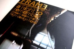
Hairywood Tower, 6a Architects and Eley Kishimoto, Frame Magazine, 2008
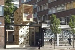
‘It’s slightly absurd and playful to conceive of this kind of space in Old Street, it’s like a folly in the landscape’ explains Tom Emerson of 6a Architects, designers of the Hairywood Tower. The project is a 6 meter high beacon that glows at night, marking a small public space and gallery in a grimy, urban setting, high above a busy roadway in East London. Tightly enclosed by aging 5 story office buildings, any sign of creativity would be welcome here, but Hairywood is surprisingly quirky and delightful, partly due to its low profile in the urban context-it can’t be seen from even a block away. Visitors are encouraged to consider the value of public space and to rediscover the simple delights of climbing up high and looking out over the rooftops --no matter the view is less than picturesque. It’s an optimistic project, ‘it’s not a manifesto, it’s light-hearted, fun’. The small lookout tower leans over the street, allowing a moment of privacy above the noisy street, ‘a public space for two’. Heads turn on the top deck of the bus as people see the play of light and shadow of the curly, cut out, laser cut plywood patterns that wrap the tower form. Designed by fashion designer Eley Kishimoto, these forms were inspired by the fairytale heroine Rapunzel’s flowing hair-- a perfect pairing with the playful form of the tower. Read more in Frame Magazine Issue 48.
Serpentine Pavilion 2007, London, NEO2 Magazine, October 2007
The eighth annual Serpentine Pavilion in London is a quirky and lopsided timber-clad pavilion, designed by renowned artist Olafur Eliasson and Norwegian architect Kjetil Thorsen of Snohetta. The temporary pavilion is a café by day and an arts venue by night, and despite a tight budget(there is no budget, just donations) and an early summer deadline(although this year 2 months late), the pavilion is always high concept and structurally innovative. Previous years have included the one that seemed to ‘breathe’ (Rem Koolhaas and Cecil Balmond in 2006), the one that crouched low in the grass with a scaly skin (Alvaro Siza and Eduardo Souto de Moura with Cecil Balmond in 2005) and the one that was a giant mountain (widely publicized but unrealized by MVRDV 2004). This year Eliasson and Thorsen have made a spiraling form that looks like a ‘spinning top’, that experiments with the architectural ideas of procession and promenade. The pavilion is all about movement, a journey rather than a destination. An exterior ramp winds from the ground, alongside the daylit café and events space, leading guests up and around the building allowing views over the treetops and down onto the Serpentine Pavilion. Queues of visitors form on sunny days to stand in the juliet balcony and look up close through the oculus in the roof to the sky or down into the interior space below. Read more in NEO2 October 2007.
"Red Bull HQ" by Jump Studios, London, ArchitectureWeek, February 2007
De La Warr Pavilion refurbishment, Bexhill-on-Sea, UK, ArchitectureWeek, Nov 2006
Located in the British town of Bexhill-on-Sea, the De La Warr Pavilion is a striking example of international modernism. It was built in 1935 by celebrated architects Erich Mendelsohn and Serge Chermayeff and has recently reopened following a renovation that rescued it from decades of neglect and damage. Seventy years ago, Mendelsohn dubbed the sleek, streamlined form of the pavilion a "horizontal skyscraper." Today, the building does not look dated at all — its form remains iconic, simple, and bold. Inside there is a feeling of glamour and spaciousness despite the building's modest footprint. London architects John McAslan + Partners were appointed in 1991 to prepare a long-term strategy for the site, which included a staged restoration and sympathetic redevelopment of the building. The first phase, completed in 2000, saw the remodeling of the auditorium to bring it in line with current needs. Read more here.
Cover Story: 'Sleeping With Celebs' Puerta America Hotel, Spain, Various Architects, Frame Magazine, Dec 2005
By now, most followers of interior fashion will have grown accustomed to the idea of a large project shaped by an army of designers, rather than a single master. Madrid’s new 14-story Puerta America for Spanish hoteliers Silken Group is a prime example of the new ‘collective’ genre. The project packages the efforts of 19 international designers to craft the hotel’s 360 rooms and common spaces. In many ways more of an experiment in marketing than in design, the venture highlights once more the emerging phenomenon of the celebrity designer. The success of the hotel will depend on whether or not top brands and the reputations of those who create them are powerful enough to fill its rooms, night after night. Guests occupy 11 identical floors, each with a small lift lobby in the middle, two corridors with rooms along both sides and two junior suites. The 12th floor is fitted out with sumptuous suites designed by Jean Nouvel. In places the hotel is intense and exhilarating experience. On the whole and especially in terms of architecture, however it is a disappointment. Rooms function as introvert, internalized environments purposely disengaged not only from rooms on other floors but also from the wider urban context. The guest waking up in Madrid might imagine herself, and justifiably so, in New York, Rio de Janeiro or London (where over half the designers are based)… Excerpt from Frame Magazine issue 47 Cover story .
"Ireland Eye" by Douglas Wallace Architects, Galway, Ireland, ArchitectureWeek, October 26, 2005
'Nouvel's Nouvel Tower', Torre Agbar, Spain, Jean Nouvel Architects, Azure Magazine, June 2005
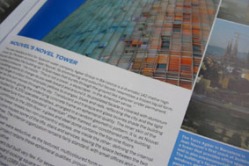
The new headquarters for Spanish water company Agbar Group in Barcelona is a dramatic, 142-meter-high “water tower.˜ It’s shimmering and colourful façade lend it the appearance of a frozen or liquid formed tower. Parisian architect Jean Nouvel describes his landmark building as “a fluid mass that bursts through the ground like a geyser under permanent, calculated pressure.” He insists: “This is not a tower, a skyscraper, in the American sense.” The building seems to change as you walk towards and around it, its pixilated façade ranging from dramatic yellows, oranges, blues and reds, reflecting the city and water and as the sun moves through the sky. Read more in Azure Magazine June 2005.
Cover Story: 'Community Action' Gleneagles Community Centre, West Vancouver, Canada, Canadian Architect, January 2005
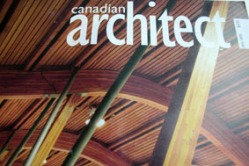
Building review of Patkau Architects´s innovative Gleneagles Community Centre in Vancouver, Canada.
Facing onto Marine Drive in West Vancouver, a dramatically picturesque suburban community about 30 minutes from downtown Vancouver, the new Gleneagles Community Centre occupies a narrow site along the highway. The most striking element in this design is the enormous timber roof that folds over the robust concrete and glass building in both a protective and dramatic gesture to the surrounding landscape. In 2000, Patkau Architects was selected to design the first new community facility in West Vancouver in more than 20 years. Principal John Patkau explains, "We wanted it to have a very public character, so we set it close to the road. We did what we could to make it civic in a suburban context." Determining the location and siting for the 24,000-square-foot community centre was challenging and required carving out a public niche in a private landscape. Surrounded by dense trees and encroaching landscape, the site has close adjacencies to Gleneagles Golf Course to the west and a visually unappealing electrical substation across busy Marine Drive to the east. Read more here.
Cover Story: Alsop Architects' OCAD, Toronto, Architects Journal, June 2004
Alsop Architects' flagship building in Toronto sails high above the street, perched on inclined stilts, an icon for Ontario College and the city. Turning the corner from Dundas Street on to McCaul in Toronto, drivers slam on their brakes and cyclists dismount to stare in amazement at a black and white checkered box perched nearly 30m into the sky on 12 multicoloured pencil-crayon legs. Alsop famously told journalists when he arrived on site and saw the tabletop in position: 'It looks much bigger than I imagined it in my mind. They always do. But it didn't let me down.' Nicknamed 'the flying tabletop', it is the length of a 30-storey building, tilted on its side. It glows at night, casts dramatic afternoon shadows and has a candy-coated, black and white pixelated surface. This is a sculpture that can be occupied and used as a lookout over Canada's largest city. Read more in Architects Journal Magazine Issue no 25, Volume 219, June 2004.
London Met Graduate Centre, London, Daniel Libeskind Architects, ArchitectureWeek, May 2004
The new, modestly sized Graduate Centre for London Metropolitan University is the first permanent building in London by Daniel Libeskind. It's not a glamorous commission compared to his World Trade Center project in New York, nor does it have a particularly beautiful or meaningful site, as does his Jewish Museum in Berlin. Libeskind accepted this commission — with an area of only 7,000 square feet (650 square meters) and a budget of only 3 million pounds — because, in his words, "every building is important" and "London needs good architecture." Libeskind won the competition for the Graduate Centre despite his lack of experience in educational building. Perhaps this explains his unusual approach, and the result is, in my view, inspiring and architecturally engaging. In this small building, Libeskind rose to the challenge of creating a sanctuary for graduate students in the heart of North London. The building is small but architecturally complex. Libeskind designed the pavilion as three intersecting volumes. One form rises toward the Underground station and the urban surroundings, another connects to the existing university building concourse, and the third nods to the city. Read more here.
"Grande Bibliotheque du Quebec", Patkau Architects, ArchitectureWeek.com, June 21, 2006
'Modern English', Cedar House, Norfolk, UK, Hudson Architects, Azure Magazine
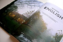
From the outside, the most striking thing about the Cedar house in picturesque rural Norfolk, England, is the silvering cedar shingles that seamlessly wrap the walls and roof. The “skin” of rapidly weathering shingles intensifies the building’s iconic form, with its dramatic, steep pitched roof and unusual, reptilian cladding. Local architect Anthony Hudson has reinterpreted the traditional British countryside vernacular, concealing modern open-plan living spaces under what he calls a “sleek protective cloak” of cedar. Even more significant, however, is Cedar house’s promise as a prototype for an architecturally designed, relatively low cost, prefabricated home. Oriented to frame views of the stream running through the property and designed to create dramatic interior spaces, this house proposes a more considered and design-led approach to prefab housing, with no apparent compromise on design quality for speed, budget and ease of construction. It seems improbable that the Cedar house, a reinterpreted barn building that sits in harmony with the rolling English countryside, was prefabricated off site and its frame erected in a week, or that the building costs for this 215-square-metre home were a reasonable £245,000 (about CAN$500,000). Read more in Azure Magazine July/August 2006.
| azure_cedar_house.pdf |
The Master At Work, new Le Corbusier church in St Etienne, Clear Magazine
‘If the church is good, it is a Le Corbusier. If it is bad, it is an Oubrerie’ the architect in charge of completing the legendary Swiss/French architect, Le Corbusier’s, last unfinished building has said. French architect Jose Oubrerie is a former apprentice of post-war modernist icon Le Corbusier, who died in 1965, five years before the construction on this project began. When Oubrerie worked with Le Corbusier, he was involved at early stages with this project, he has seen it come full circle, completing in the summer of 2006, as he nears the end of his career. Oubrerie, 72, is reluctant to speak too much about the project, urging those interested to see it for themselves before drawing conclusions. There is no doubt he feels unbelievable pressure to live up to the expectations of both his memories of working with the Master, and to Corbusier fans around the world. Foundation Le Corbusier, a French trust that looks after all things relating to the architect, strongly supports this project, arguing it completes the Corbusian trilogy which includes the Ronchamps Chapel (1955) and Convent of La Tourette (1959). This project has also become a major part of the region’s regeneration. In fact, it is being considered for UNESCO World Heritage status and forms an integral part of the bid for St Etienne’s ‘European Capital of Culture’ status in 2013. Read more in Clear 25.
"Welsh National Assembly", Cardiff, Richard Rogers Partnership Architects, Architectureweek.com, August 2006
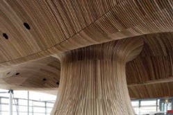
Despite the breathtaking views over Cardiff Bay toward Penarth Marina, visitors to the new National Assembly for Wales, standing on the grand, slate-clad terraces, will find it is impossible to stop looking inland. Designed by Richard Rogers, known for his iconic buildings such as Lloyds of London, Centre Pompidou, and the Madrid Airport, the National Assembly building opened in March 2006 after years of political wrangling. A striking red-cedar soffit undulates through the building and out toward the harbor. The use of natural materials such as wood and local slate is just one reason the building is being heralded as a pioneering example of sustainability. It may also be one of the most important and controversial projects of Roger's career. The Welsh National Assembly was founded in 1987 following a referendum, and allows the Senedd (parliament or senate) the sought-after powers of home rule. This important organization needed a world-class building to portray its identity and to encourage local pride and interest in politics. Read more here.
Ormonde Jayne Perfumery, Caulder Moore, London, Frame Magazine
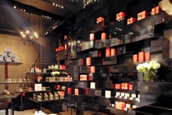
In the Grade 2 listed Royal Arcade off London’s high fashion Old Bond Street, the exclusive Ormonde Jayne perfumery has re-opened its tiny boutique, completely redesigned by luxury retail interiors specialists Caulder Moore. The designers crafted the complete brand-- from the moody and evocative store interior, the simple yet luxurious branding and graphics, to the distinctive vibrant orange packaging. The intimate space, which comfortably suits two or three visitors at a time, has high ceilings that are exaggerated with floor to ceiling, rough textured, gold shargreen fabric wallpaper on one wall with the opposite, mirrored wall showcasing floating planes of smoked, black glass shelving. ‘The glass shelves have very sharp edges-- like a diamond’s edge’ says Caulder. “They also reflect the design of the glass bottles for the perfume”. A glossy black testing table with leather stools allows guests to sample and learn about the scents, and a bright orange lacquer box of coffee beans is nearby to reset the tester’s sense of smell when it all gets too much. Read more in Frame Magazine Issue 48.
Cover Story: 'House on the Hill', Hill House, Brian Mackay Lyons Architects, Canada, Azure Magazine, Jan/Feb 2005
Minimalism in art, though ground breaking in the 1960’s and revolutionary as a concept, can be a tad boring to the uninitiated. With bold geometrical forms, large areas of flat colour, and less fussy details, when architecture tries to be minimal, the results can be much more easily digested. Pared down, ‘simple’ architecture has come to embody ideals of refinement, sophistication and the ultimate expression of good taste. But this ‘plain’ architecture comes with a price. It’s more challenging to work with a limited material palette, to join materials and to design details around glazed openings and entries. These require a skilled craftsperson to construct and an experienced architect to imagine. Nova Scotian architect Brian Mackay-Lyons has been honing his skills as a modern architect for more than two decades. In his new house he uses what he calls his ‘zero’ approach to detailing. Hill House, perched on a drumlin on the Kingsburg peninsula, was completed in April, and is his most minimal house to date. He admits ‘it’s so austere its painful’ but this rigour and discipline has resulted in a crisp, sophisticated design for a two story residence with detached guest house within sight of several of his earlier housing experiments that dot the rugged coastline in Nova Scotia, Canada. On a clear day, you can see Hill House from miles away... Read more in Azure Magazine Cover Story, Jan/Feb 2005.
Serpentine Pavilion 2006, NEO2 Magazine, October 2006
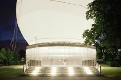
Every year the Serpentine Pavilion in London’s Hyde Park hosts a temporary summer pavilion designed by an innovative International architect (past designers include Zaha Hadid, Daniel Libeskind and Toyo Ito among others). This year’s pavilion is an experimental, inflatable, balloon that responds to the changing weather. Sailing high on sunny days, the cables that secure the membrane to the ground are loosened and the roof rises above the tallest point of the gallery behind. Evocative and dynamic, the ellipsoid shape of the dome is visible across the park, as it rises in fair weather to a maximum height of 24-meters. The blobby helium and air filled white canopy envelops the small, steel framed pavilion below, a translucent box clad in polycarbonate sheeting that obscures the view of the park. A café by day and entertainment venue by night, the striking pavilion is co-designed by Pritzker prize winning Dutch architect Rem Koolhaas and renowned structural engineer Cecil Balmond. Read more in NEO2 Magazine October 2006.
'Concrete Ideas', Anderson House, Jamie Fobert Architects, London, Azure Magazine, Sept/October 2004
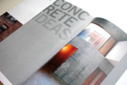
...Fobert's latest project is the radical refurbishment of a run down Victorian house in London and the transformation of this derelict building with a series of cramped rooms and mean windows, into a contemporary family home. On a visit to the site, Fobert explains his aim is to open up the building and create generous spaces through careful choice of materials such as concrete and timber and to bring light into the building using rooflights and large sliding glass walls into the garden. It’s still under construction and Fobert is gesturing around the large volume explaining how it will look once the timber fittings and partition walls are installed. Touring the site, he has the air of a chef sampling the ingredients and perfecting the main dish before it is served. ‘This is lightening up nicely’ Fobert remarks fondly, running his hand along the gritty concrete surface and brushing off dust and dirt, ‘just look how luminous it is in the light’. It’s true: the sunlight is pouring into the once dark and dingy basement area, now a double height volume opening out to the garden and this glossy and textured insitu concrete wall is one of the focal elements of his new main living space. Read more in Azure Magazine Sept/Oct 2004.
University of Scarborough, Brian Mackay-Lyons Architects, Ontario, Canada, Architectural Record, August 2004

Brian Mackay-Lyons’s new Academic Resource Centre (ARC) at the University of Toronto’s Scarborough Campus is a functional and elegant addition, sympathetic to John Andrews’s celebrated building, which opened on the site in 1966. The linear, concrete mega-structure, a heroically striking, Brutalist form, still snakes across the landscape. Andrews, an Australian architect, intended this structure to be part of a non-rectilinear plan that could be easily expanded. However, his original scheme was never completed. Financial constraints prevented the campus from fulfilling its potential and many of the key features, including a central library and arts wing, remained unfinished. In recent years, the campus has outgrown its postwar incarnation as a small, non-residential suburban college and has begun to flourish as an independent branch of the University of Toronto. With new government ‘Superbuild’ funding, the school has received $150 million to enlarge and enhance the campus and is doing so with several projects by an assortment of architectural firms. Brian Mackay-Lyons, a Halifax based architect known for his cleanly articulated Faculty of Computer Science building at Dalhousie University in Halifax, convinced Scarborough that the new ARC building should be distinctly different from the powerful Andrews one. He developed a scheme in which the new structure, which was to house the intellectual heart of the campus—the central library and resource centre, a new lecture theatre, and a small art gallery—would resemble a well-articulated, industrial shed. Read more in Architecture Record 08/2004.
Toledo Museum of Glass, Ohio USA, SANAA Architects, Clear Magazine
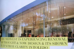
While the design of the Glass Pavilion at the Toledo Museum of Art references the city’s history as a glass-making centre, Japanese architects SANAA chose to radically shift the visitor’s expectations of glass as an industrial material, looking towards the future. An architectural and technological experiment, it is made using more than 200 tons of glass, with only the roof and a few internal walls made of steel and even these are concealed with plaster finish. On the façade, the glass walls are set into channels in the polished concrete floor to create the illusion of a sliding screen of glazed panels. Four and a half meter high glass panels stretch floor to ceiling, with no frames or clips as in traditional steel and glass construction. The building creates experiences that are entirely unheard of in typical gallery spaces—the interior walls are distractingly beautiful, made of low iron, pale glass. Read more in Clear 25.
Abbott's Wharf Housing, Jestico + Whiles Architects, London, ArchitectureWeek.com, May 2006
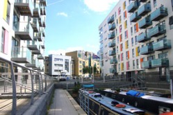
On a former industrial site in East London, overlooking the Limehouse Cut canal, renowned housing designers Jestico + Whiles have completed work on Abbotts Wharf, a landmark housing development. It is situated in the ethnically diverse regeneration area known as Limehouse, an up-and-coming neighborhood with commuter links and views to the center of London. Abbotts Wharf creates a new public promenade from the road to the water, with four high-density housing blocks. One is four-story, two are eight-story, and the fourth is a thirteen-story tower. These four structures are wedged between the water and a public park. The site ramps from the road down to a new mooring area for boats on the Limehouse Cut towpath. The architects have much experience in transforming waterfront warehouses into desirable homes, and their work with leading UK private developers has resulted in the construction of many high-profile projects. They are known for the nearby Oceans Wharf development of 54 luxury flats — in which all units were sold before construction even started — and for the award-winning renovation of heritage-listed warehouses into 300 flats at Butler's Wharf in another East End regeneration area, Isle of Dogs...Read more here.
Kunsthaus Graz, Austria, Spacelab Architects, ArchitectureWeek.com, December 2003
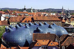
Something unexpected has appeared on the bank of the River Mur in Graz, Austria. Between the red brick roofs of neighboring historic buildings, "the friendly alien," as it is locally known, has landed in Austria's second largest city. In celebration of Graz's status as Cultural Capital of Europe 2003, British architects Peter Cook and Colin Fournier, in association with the Austrian firm Architektur Consult, have designed the Kunsthaus Graz, a new gallery for contemporary and multidisciplinary art. Cook and Fournier entered the international competition for the Kunsthaus together as "Spacelab" and won in 2000. Cook, a member of the famed 1960s architecture group Archigram and winner of last year's prestigious Royal Institute of British Architects Gold Medal Award, teaches with Fournier at The Bartlett School of Architecture in London. Read more here.